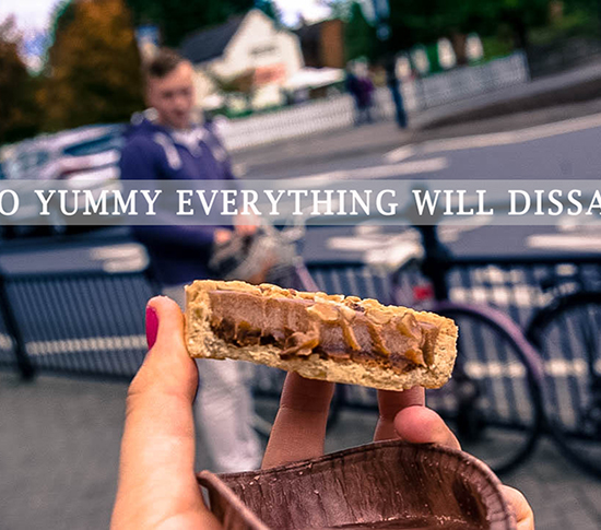
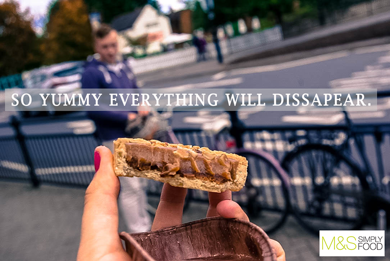
This ad is part of a M&S Food campaign that was made in May 2015.
We thought for a long time about how to make an ad that would express the
delightful taste in the best way possible. We therefore went to M&S and bought some snacks
to try out for ourselves. And when we tasted one of those delicious pies, it happened
exactly like in the photo: Everything just disappeared.
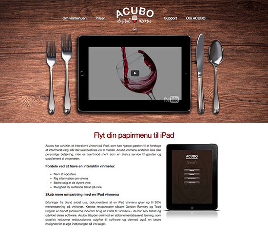
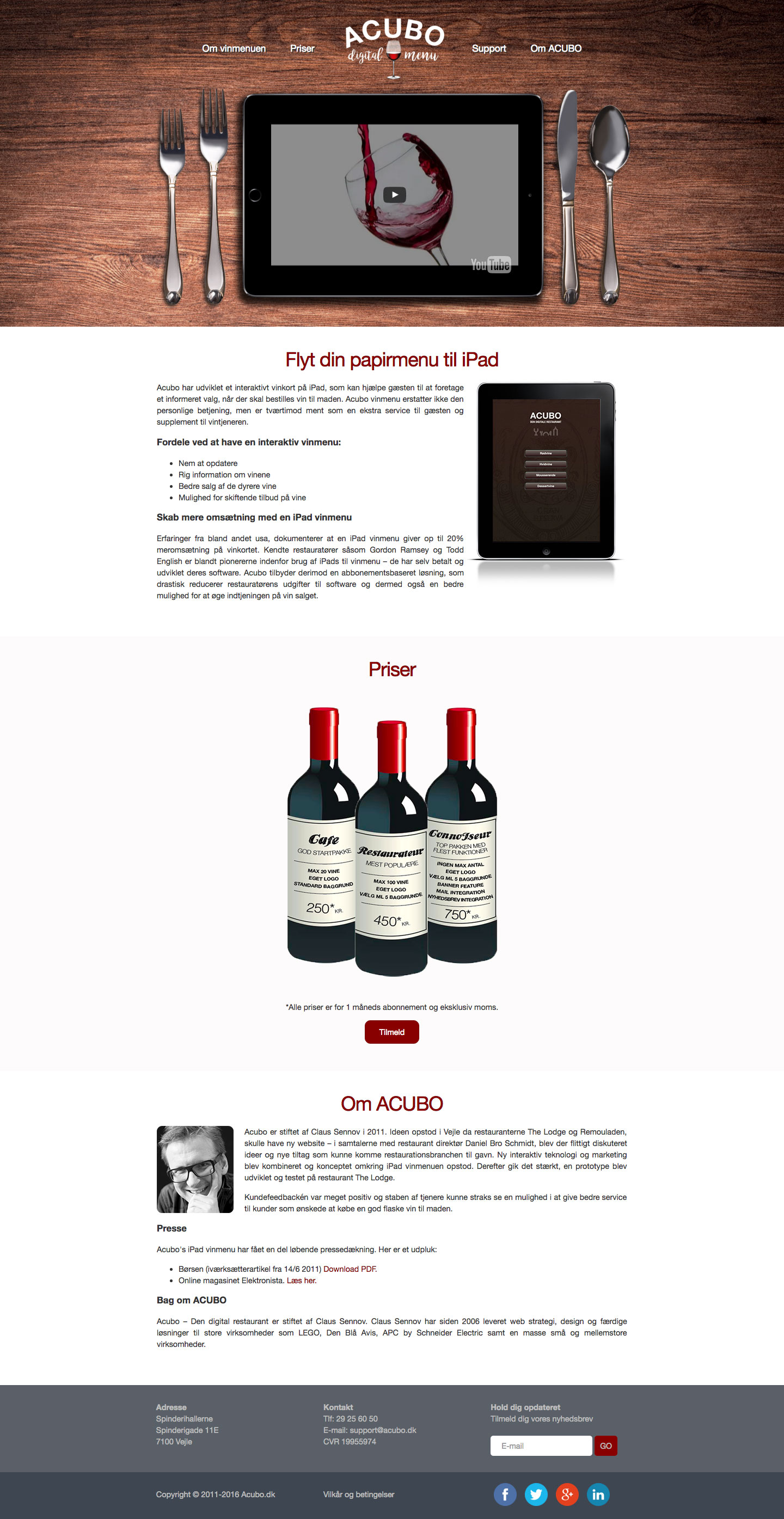
The own of Acubo contacted us because he need a rebrand if his website
along with a new logo for a digital wine menu that he had created.
The first thing we wanted to do with the website, was to make it more
visiable for the visitors to see what the purpose of the product is. We decided to go
for a minimalistic design with the focus being on the product. We did this by making an
interesting header, that showed the menu on the table as if it was in a restaurant.
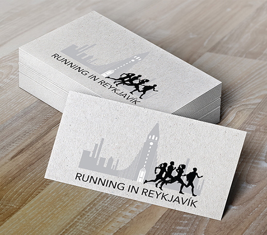
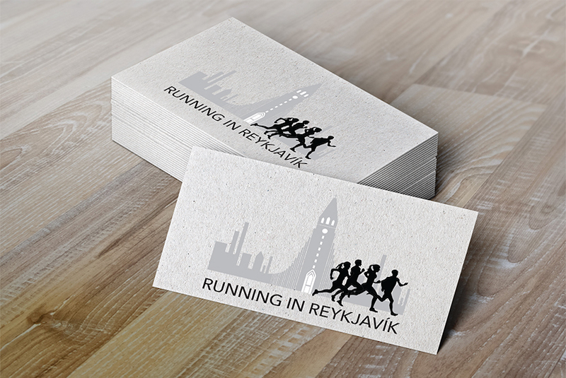
A young woman contacted us because she needed a logo for her new company,
Running in Reykjavík. A company she had started for tourist to run with her around
Reykjavík.
One of the most famous places in Reykjavík is Hallgrímskirkja, so Heiðrún
instantly got dragged to the thought of putting it in the logo. After getting some inspiration,
Heiðrún decided to puzzle together a graphic image of Hallgrímskirkja that she made by hand
and some runners. The owner wanted the name to be in the logo so it was put underneath.
After trying out some colors and versions with flags, this was the final idea and we put
it on business cards for her to advertise her little company.
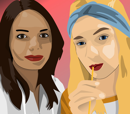
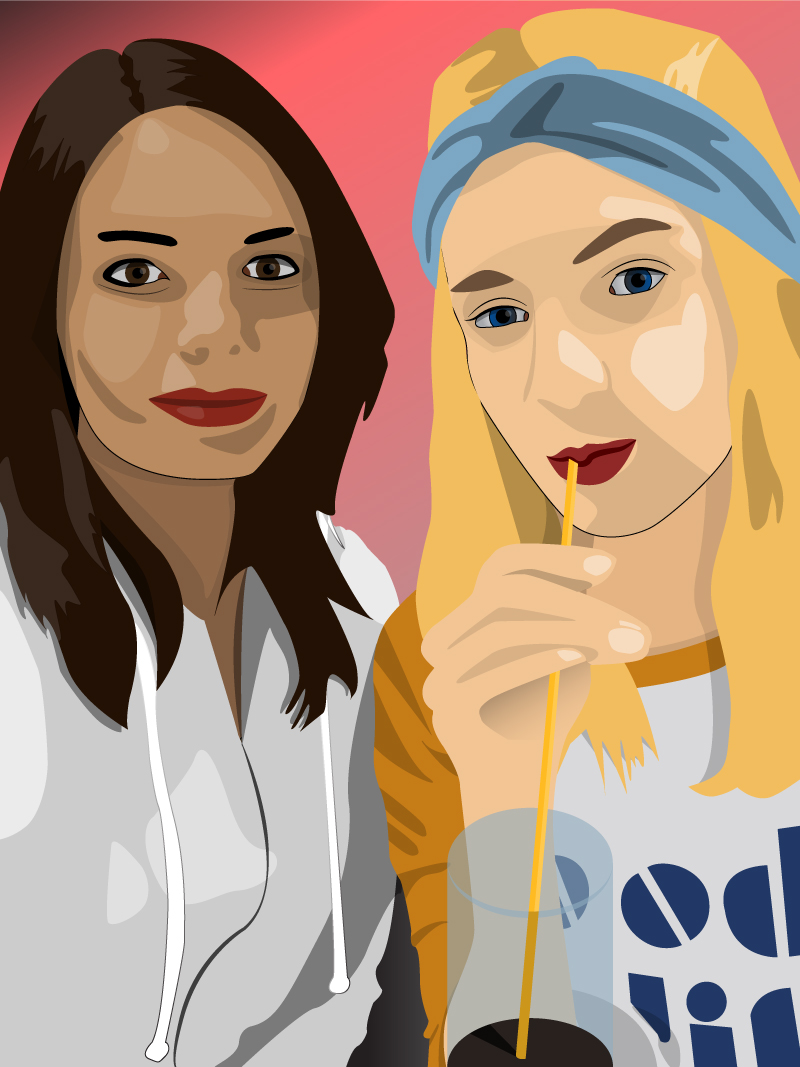
This piece of graphic was made in connection with our participation in the
Digital Arts Expo 2015 that is held annualy in Gdansk, Poland. Along with this illustration, we presented another nine pieced which, in
overall, have had very positive assessment.
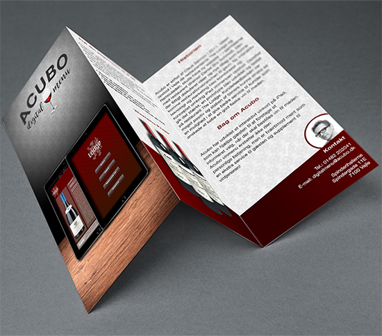
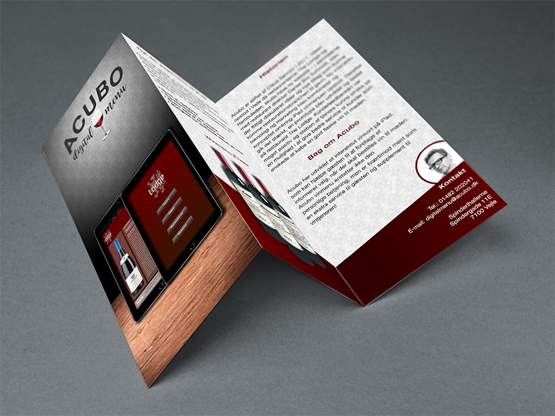
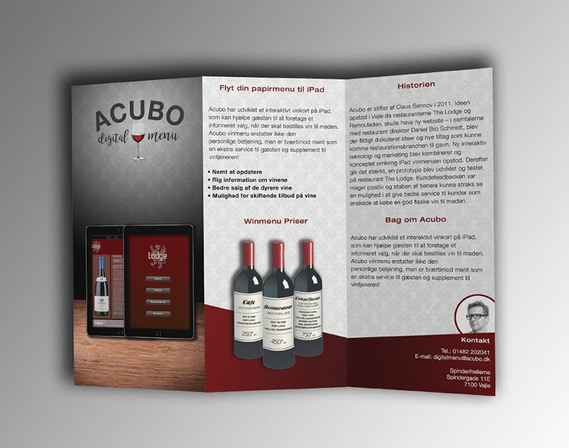
This brochure was made as a part of a markerting campaign for the Digital
Wine Menu app by Acubo. Along with this piece we also created business cards, posters, and gifts,
but also a completely new website for the company which is also to be seen under our work.
The Digital Wine Menu, due to its uniqueness, was very challenging
project, but in a good way, and we are always happy to be a part of projects like this.
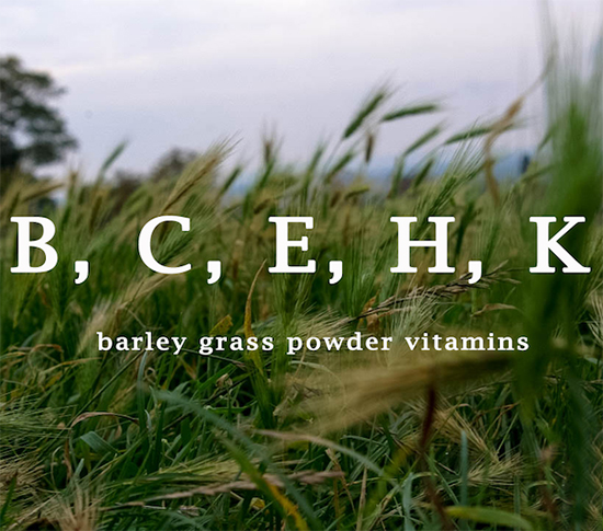
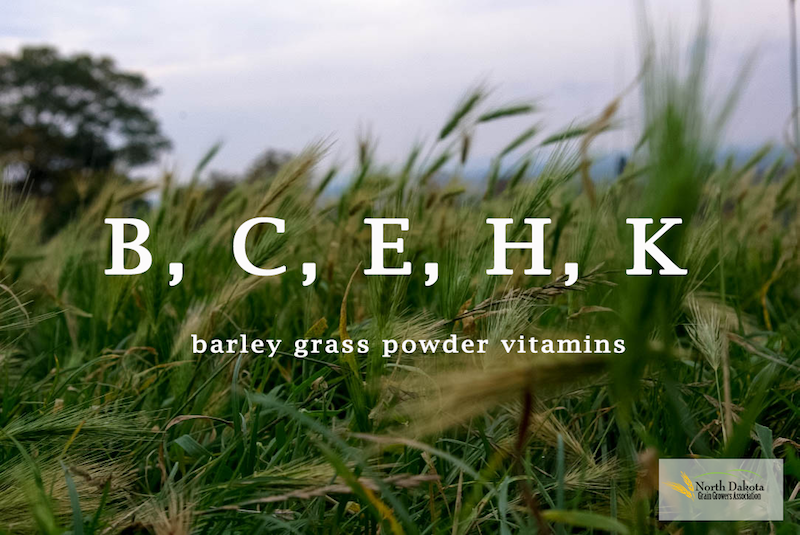
This ad was made for North Dakota Association, which produces barley grass
powder among other things.
The powder is well known for its beneficial influence on health so we
decided to use a photo of the natural environment of barley. We also chose to write
what vitamins it contains as that is one of the main things people care about when it comes
to their health.